Selecting a paint colour for your room
September 19, 2022
One of the most common mistakes people make is selecting a paint colour first and then trying to decorate around it. The paint colour is the last thing you should select! Think about putting together a woman’s clothing outfit. Would you select lipstick first and then go shopping to find the outfit, shoes and accessories? Of course, not. The same is true when decorating your home.
First, consider the palette and feeling for the whole home. You want some continuity between the rooms in terms of the feeling. A single trim colour that carries throughout the house could be one of the connecting elements.
Have a look in your closet. Do you have a closet full of black, white and neutrals or lots of bold colour? You will likely feel more comfortable in a space that shares the colour aesthetic of your wardrobe, believe or not!
I often begin a room design by selecting the area rug or a special piece of artwork. From there, I can begin to pull together the fabrics, furnishings, accessories and develop an overall colour scheme. Only at the very end of that process will I select the paint colour for the space.
When I am finally ready to select paint, choosing the correct undertone to work with the flooring and decor selections is key. If the undertones don’t work together, you will not achieve a harmonious result. What do I mean by undertone? For example, a ‘beige’ or ‘grey’ could have a warm (pink) undertone, or a cool (blue) undertone. Make sure you determine the undertone as it should carry throughout the home.
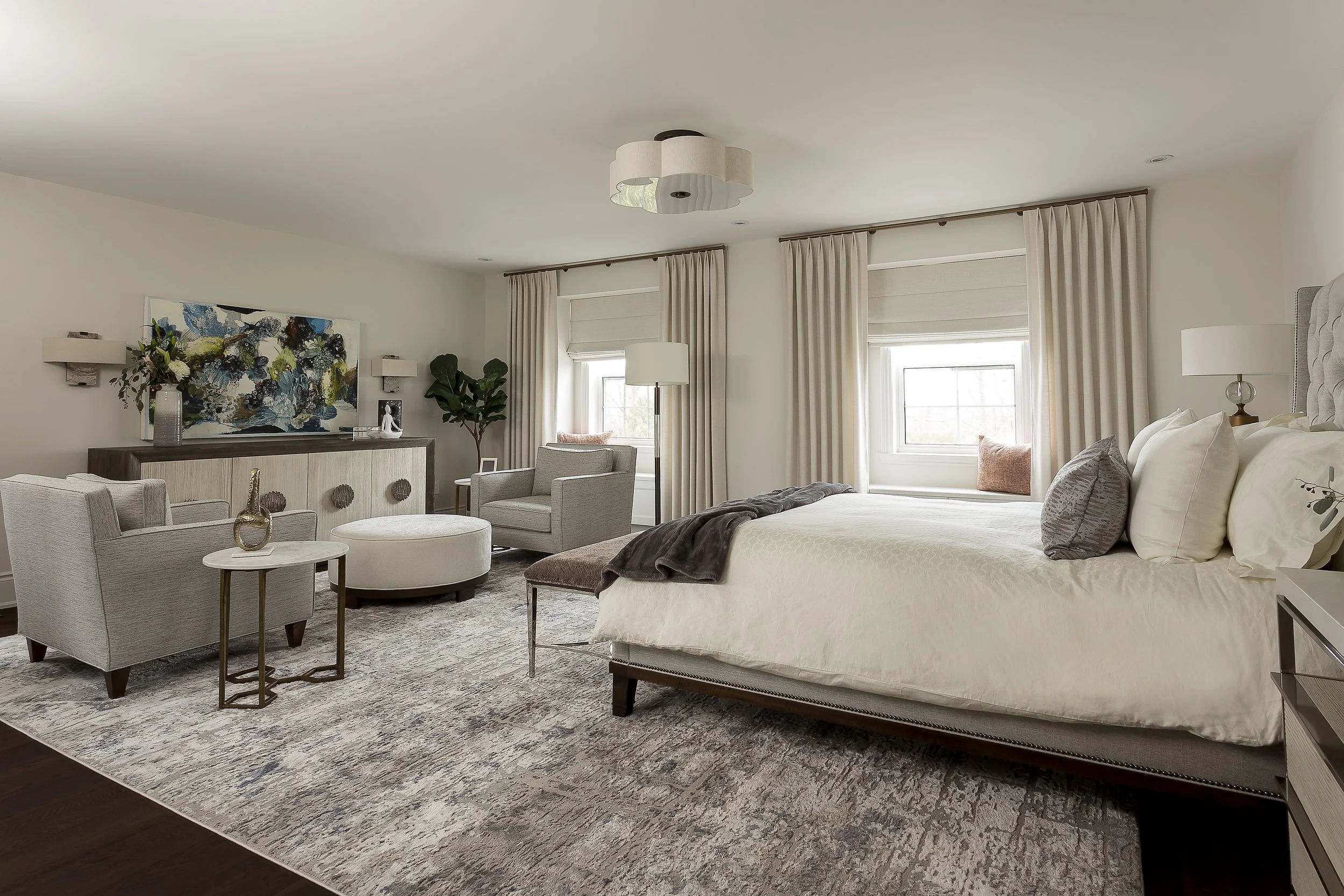
In this principal bedroom, the design brief was to keep it light and airy. We used Benjamin Moore’s Sea Pearl (OC-19) with a cool undertone to complement the blues and grays of the rug and dark floor. To minimize contrast we used it on the trim as well as the walls.
When selecting paint colours, remember that creating contrast draws attention. So if you have eight foot ceilings and narrow trim, consider minimizing the contrast between the trim, wall and ceiling colour to give a feeling of greater height.
In this reading room, we went dark and moody with Benjamin Moore’s Hale Navy (HC-154) on everything except the ceiling. Even though the depth of colour is a departure from the other rooms, there were tones of the same blue throughout the remainder of the house in art and rugs.

Having difficulty getting started? Book a discovery call to find out how we can help: https://www.yassein.com/contact.html.